Selected work/Project Shreddit
Reddit.com Redesign
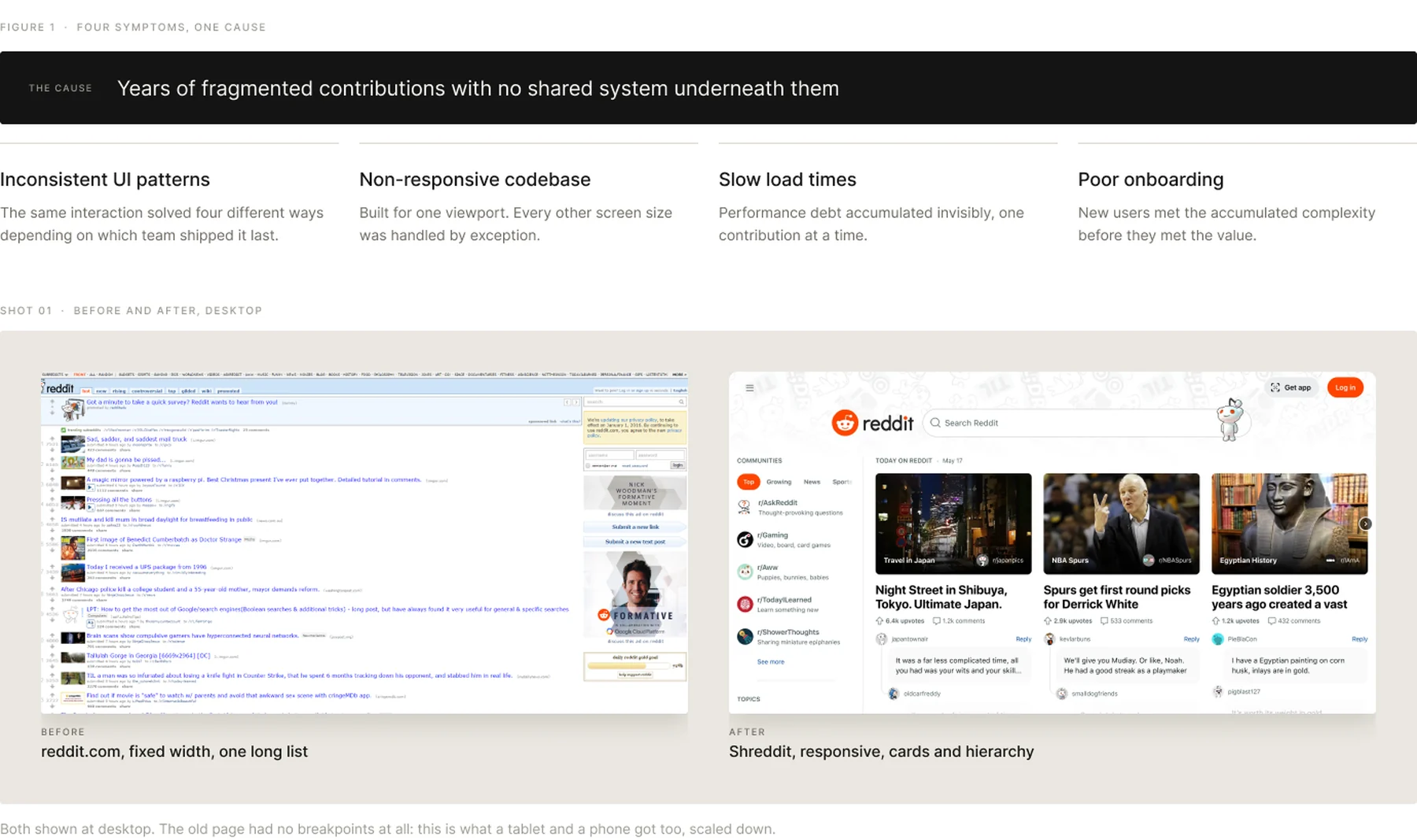
Years of fragmented contributions had left Reddit with inconsistent UI patterns, a non-responsive codebase, slow load times and poor onboarding. Eleven months later it shipped as Shreddit, rebuilt for an audience that now included investors.
ROLE
Director of UX
Design leadership, process, and the case for scope.
TIMELINE
11 months
Kickoff to internal beta, then public launch.
TEAM
6 core
Director of UX, 2 product designers, 1 design technologist, 1 PM, plus the design system team. Sat inside a 33-person design org.
CONTEXT
Pre-IPO
Platform quality, scalability and consistency under investor scrutiny.
Section 01
What Had Drifted
Fragmented contributions over several years, each reasonable on its own, had compounded into four separate problems. They shared one cause and needed one fix, which is the argument that got the project funded.
Section 02
Arguing The Scope Up
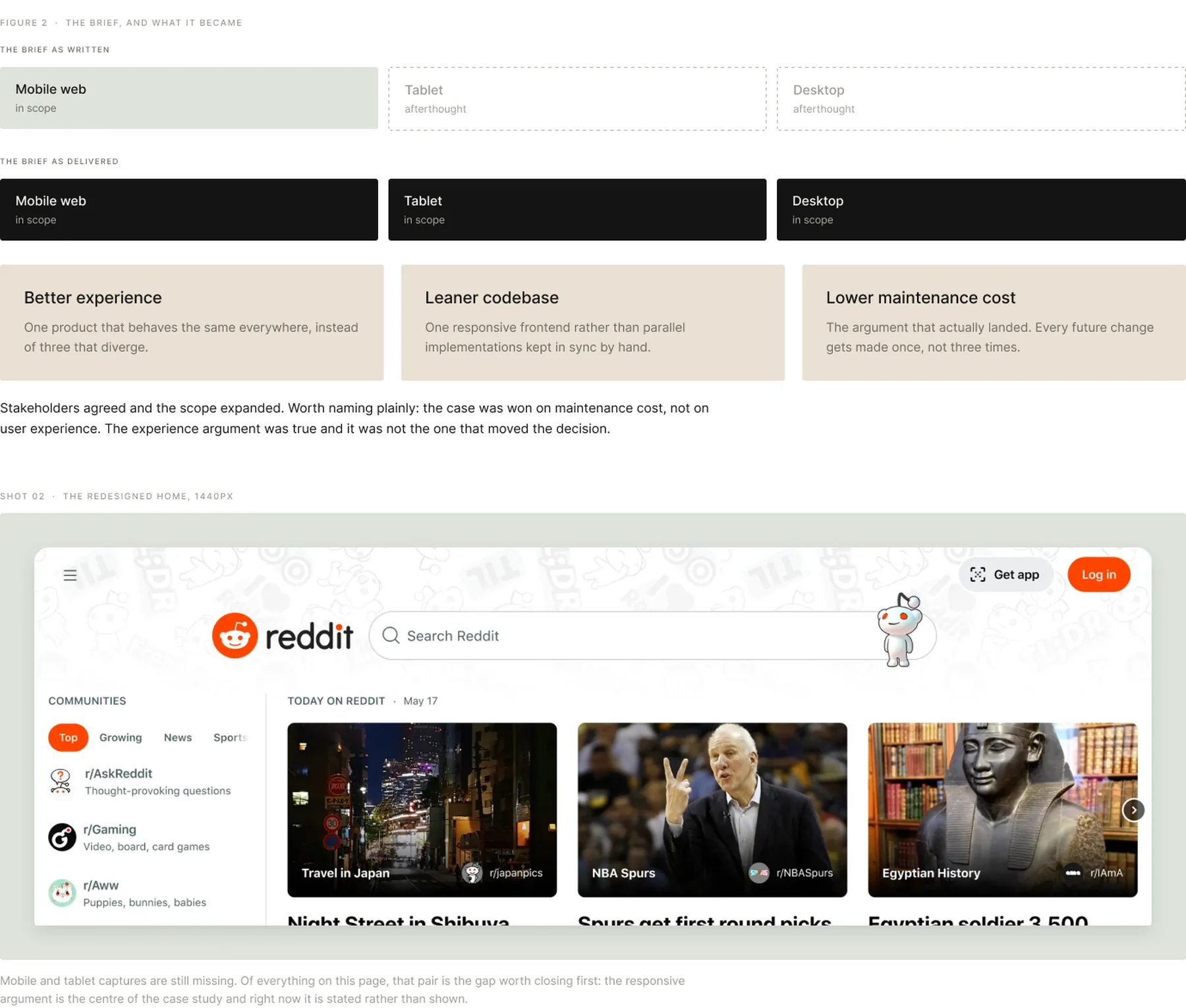
The brief that arrived was mobile web only, with tablet and desktop treated as afterthoughts. Arguing it up was the highest-leverage decision on the project, and it was won on cost rather than on craft.
Section 03
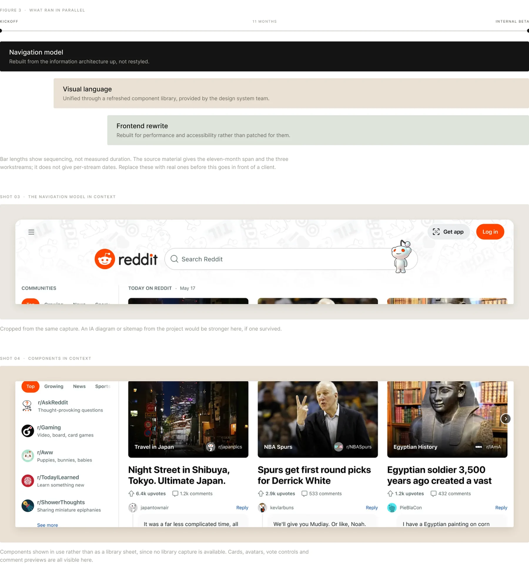
Three Workstreams, Eleven Months
Navigation, visual language and frontend ran in parallel rather than in sequence, because none of them could be finished without the other two. Every decision was anchored in real user behaviour through prototype testing and feedback loops.
Section 04
The Constraint Nobody Mentions At Kickoff
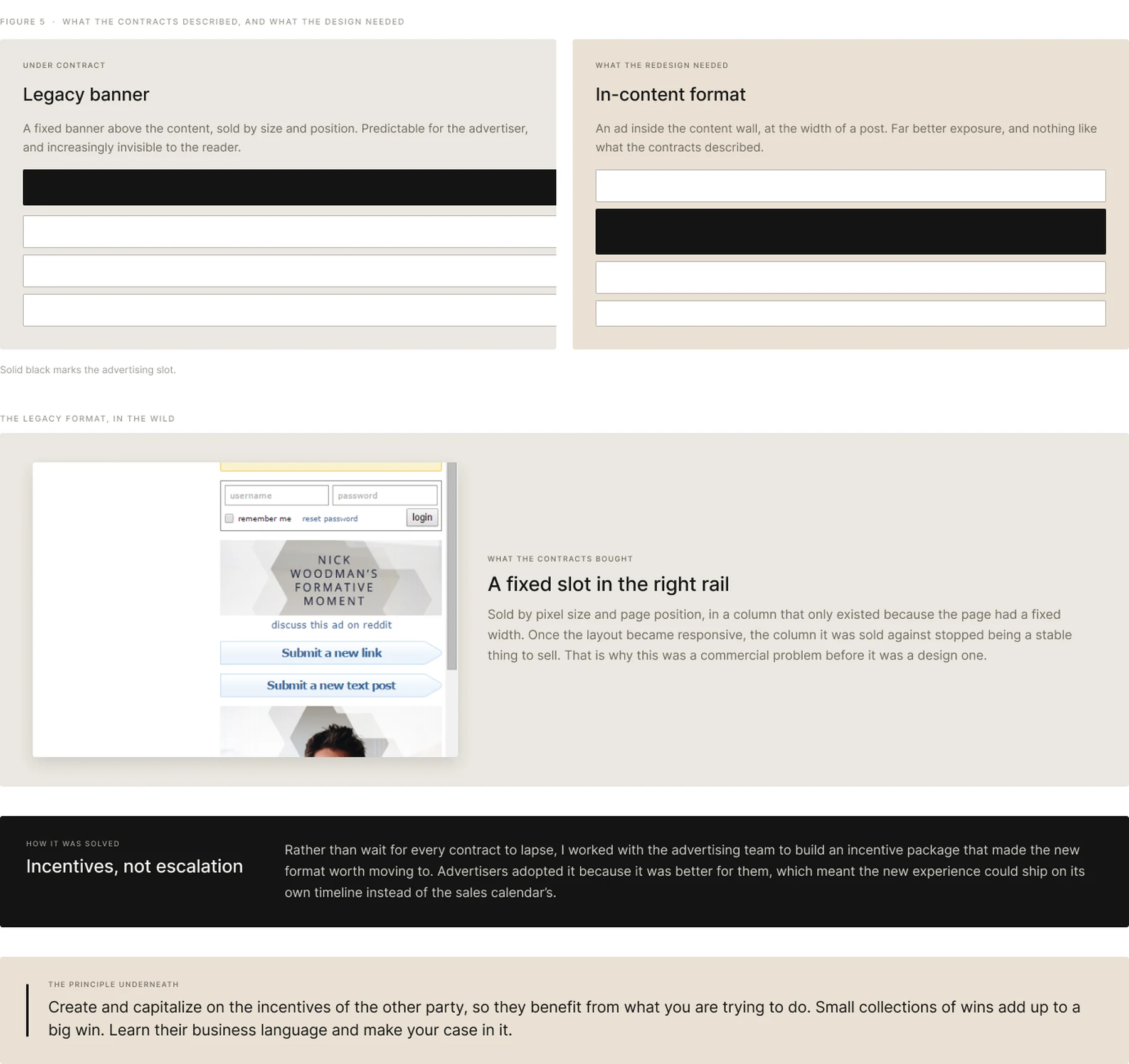
Reddit’s advertising inventory is sold years in advance, with contracts that specify size and exposure precisely. The new design introduced placements, layouts and sizes that appeared in none of them. This is the kind of thing that quietly kills a redesign after the design work is already done.
Section 05
Reddit, The Beautiful Chaos
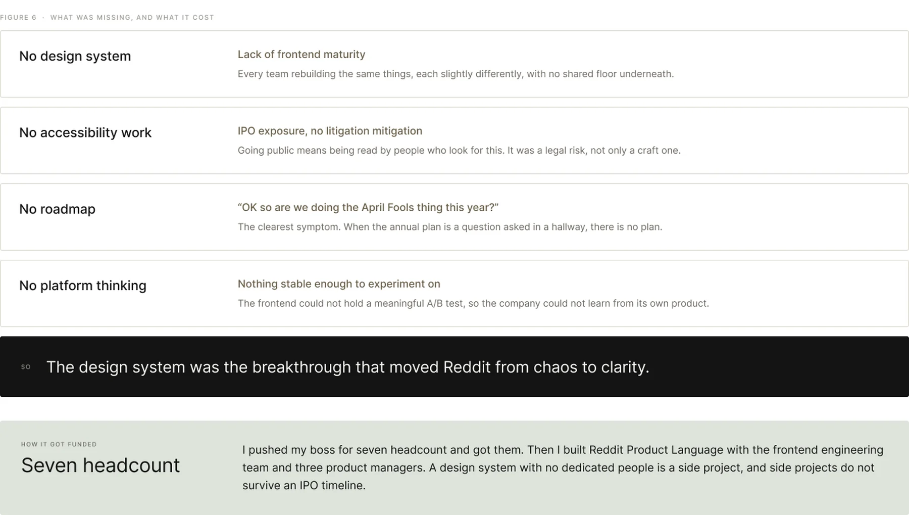
Four things were missing, and each one blocked the redesign from a different direction. Any one of them alone would have been survivable. Together they meant the frontend could not be trusted to carry a redesign at all.
Section 06
What Reddit Product Language Actually Offered
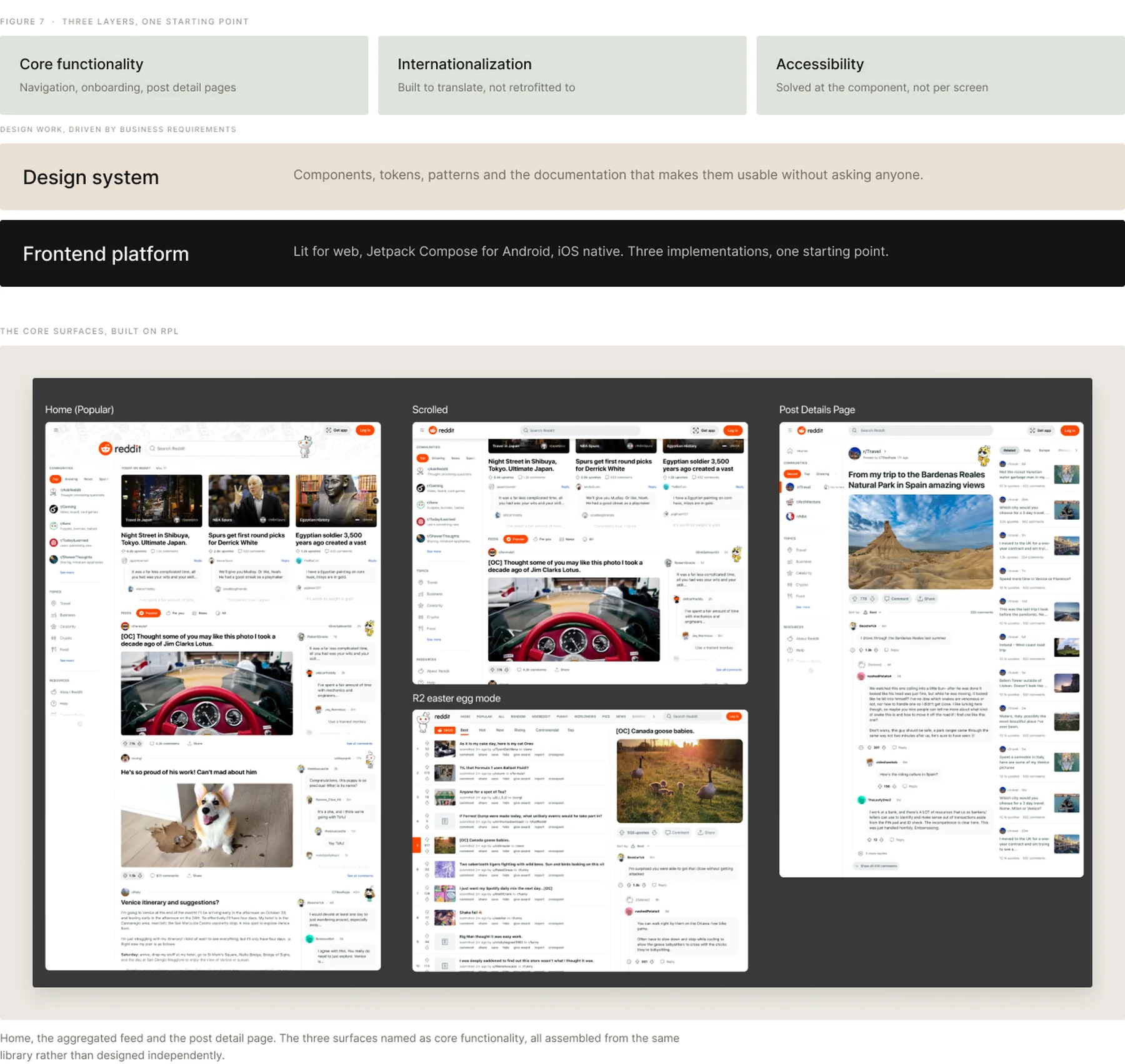
RPL was structured as three layers rather than a component library with a website attached. Product work sits on top, the system in the middle, and one platform underneath so that web, Android and iOS start from the same place instead of converging later by hand.
Section 07
How Success Was Measured, Phase By Phase
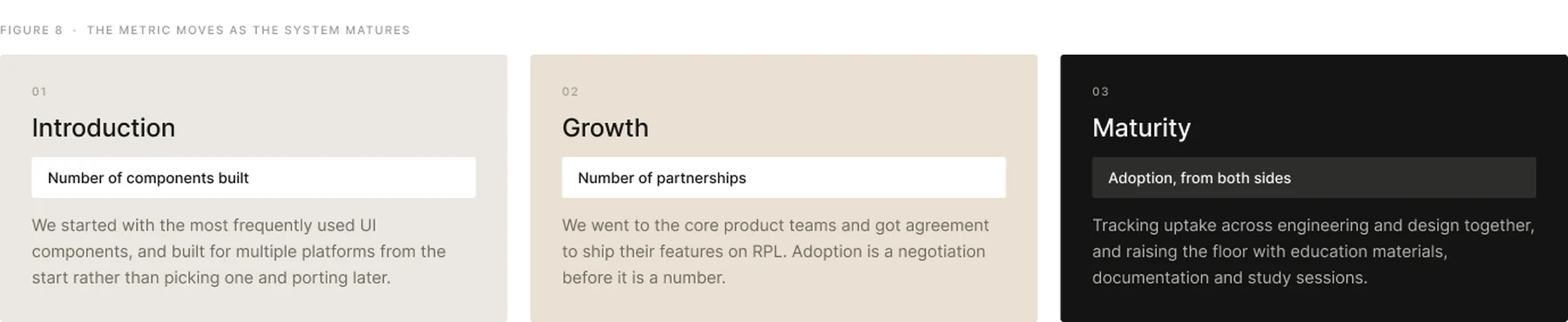
The metric changed as the system matured, which is the part most teams get wrong. Counting components forever tells you nothing about whether anyone is using them.
Section 08
A Unified Language, Without A Straitjacket
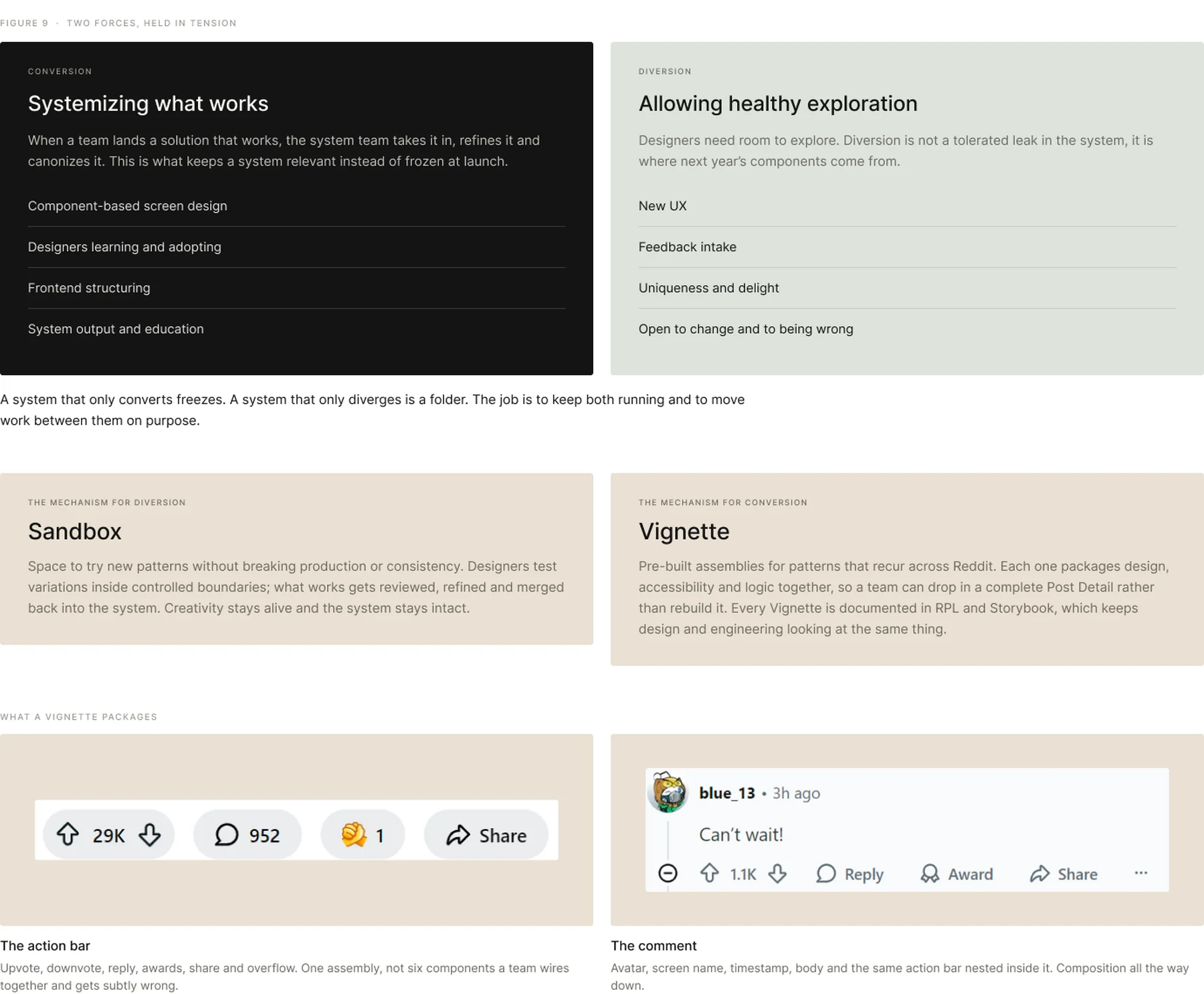
A mature design system unifies patterns without suffocating the people using it. Over-enforce consistency and you slow innovation and lose your best designers to boredom. The model we ran had two opposing forces, deliberately kept in tension.
Section 09
Documented, Or It Does Not Exist
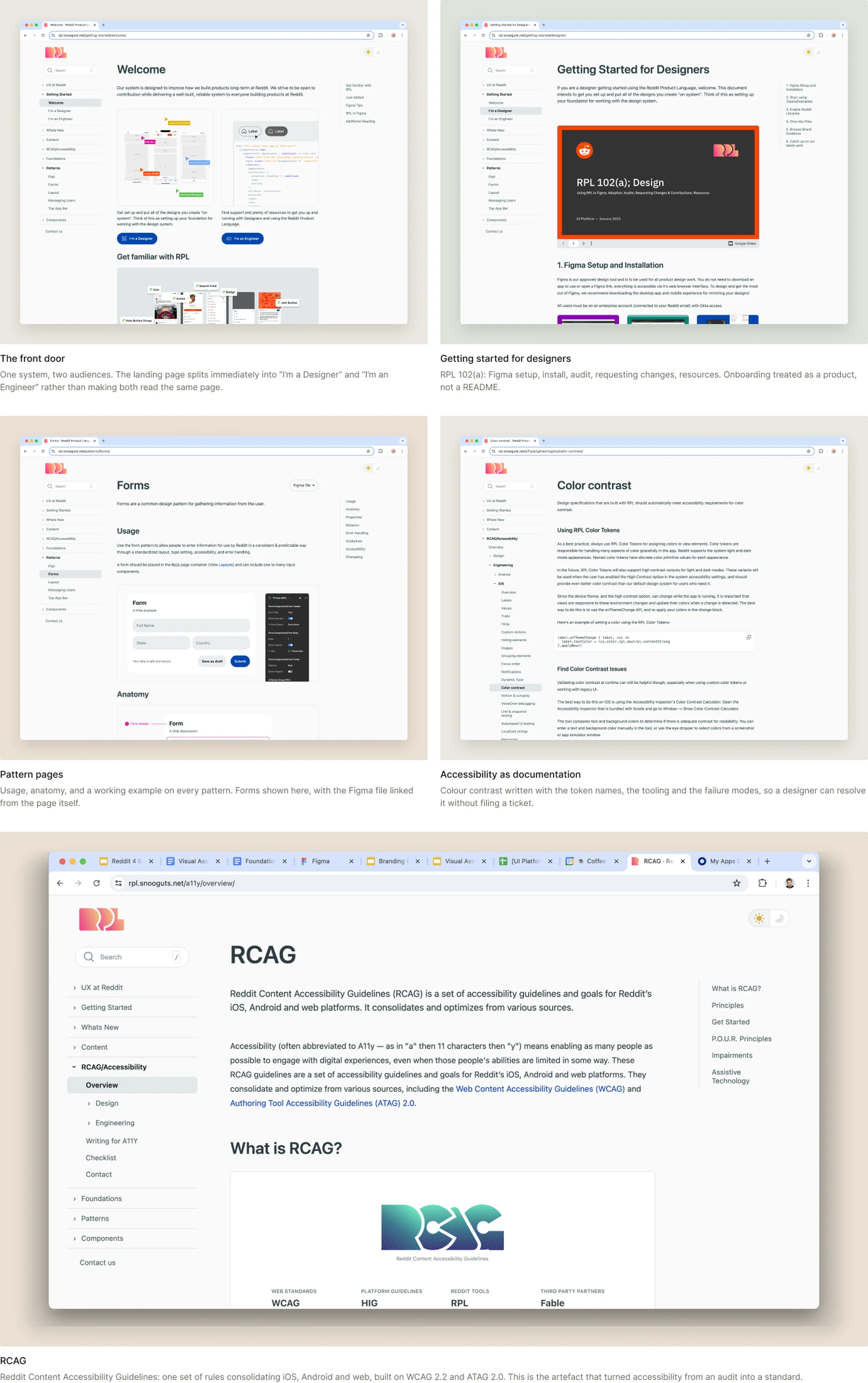
RPL shipped with its own site: separate entry paths for designers and engineers, pattern pages with usage and anatomy, and accessibility guidance written to be followed rather than cited. A component nobody can find is a component nobody uses.
Section 10
The Hard Part Was Not The Interface
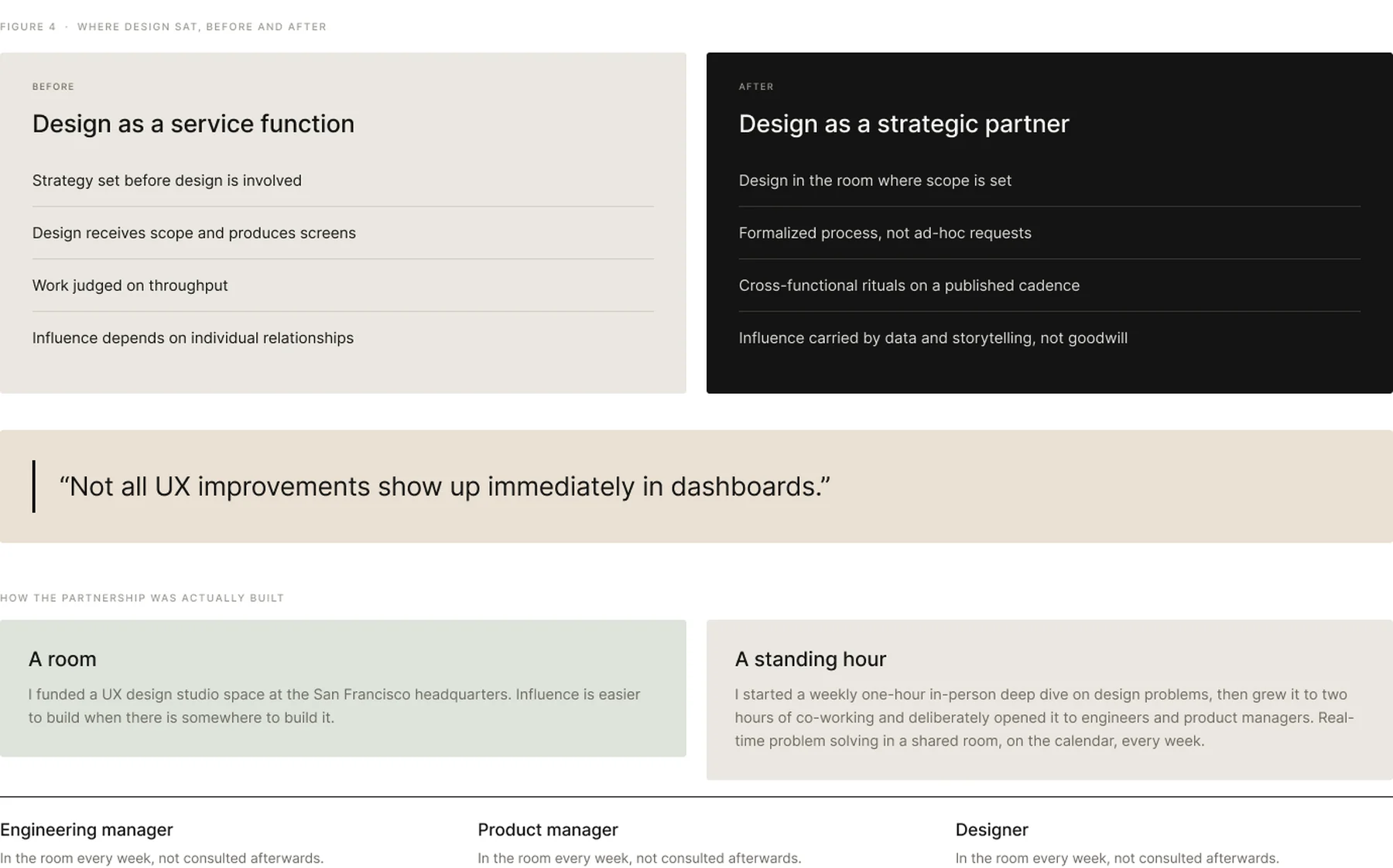
Reddit was engineering-led, and design was not at the strategy table. The redesign was the visible deliverable. Moving design from a service function to a strategic partner was the actual work, and it had no artefact.
Section 11
IPO Readiness
The redesign had to demonstrate platform quality, scalability and product consistency to an audience that had never used the product and would judge it in a single sitting.
